Cahyadesthian R. Widigda | UX Design (concept to delivery) Three days in March 2023 * this project is created for Google UX Design Certification
My Responsibilites
Conducting research
Interviews for customer needs
Creating lo-fi and hi-fi wireframe and prototype for mobile, tablet, and desktop screen
Conducting usability studies
Accounting for accessibility
Iteration on designs.
Project Overview
The Product
Custy Food is a service related to help people to get to know about how to cook and know what to cook a healthy food 🥗
Problem
People have desired to get healthier. It can be reach by making the healthy food. Most of them are engaged to have but sometime demotivate when doesn’t know about the recipe or doesn’t have about the recipe.
The Goal
Provide a platform where people can get recipe to make healthy food and motivate each other to do get heatier by make their food healthier.
Understanding the User 👤
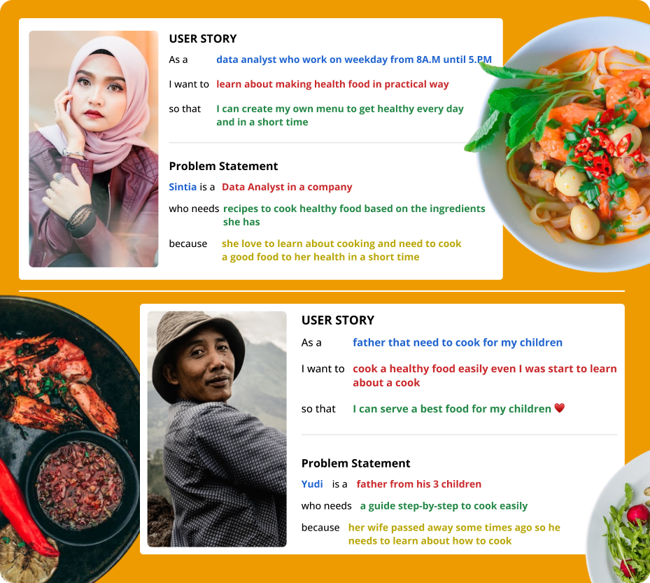
I conduct interview with some of my friend that have concern or interest with healthy lifestyle. They usually share their healthy activities like exercising and cooking. I proposed two group for this initial attempt. One group represent the early adopter as targeted end-user that need a practice or fast way to create healthy food, another one representative those who need a help to explore and guided step-by-step of cooking healthy food in very comfortable way
Pain Points
Available Ingredients
It very interesting to make a healthy food but when it comes the information about the ingredient that not available in your kitchen. It demotivates you to start the cook
New Word related with cooking
Cooking could be something new for some of people. Sometimes they get confused with the word related with kind of a cut or other stuff related with the process involved in a cooking process
Demotivation
Sometime cooking alone without any friends to share make demotivate.
Persona
User Story & Problem Statement
User Journey
Starting the Design
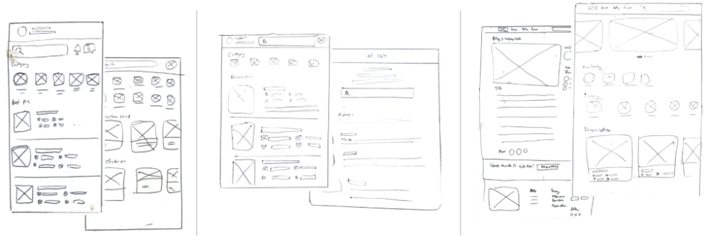
Paper Wireframe
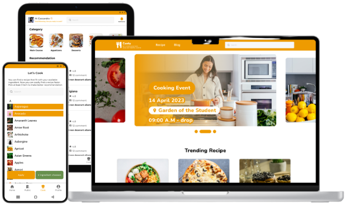
Allocating some times to draft iterations of key screen of the app’s flow of find a recipe and show about the ingredient, step to cook the dish for mobile, tablet, and desktop screen.
Digital Wireframe
Low-fidelity prototype
By completed set of digital wireframes,low-fidelity prototype created. The primary user flow is about see recipe, search food by ingredient, and share the cooking result
Two rounds of usability studies conducted along the process. First study helped guide the designs from wireframes to mockups and adjust some broken flow. The second study used a high-fidelity prototype and revealed what aspects of the mockups need to be refined.
Round 1 findings
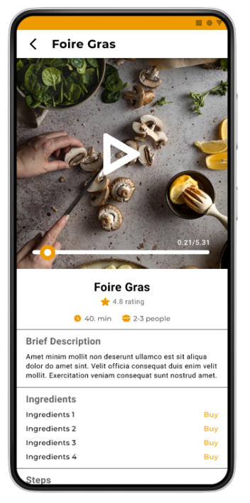
User tend to know about ingredient info to purchase. So it add a “buy” feature on ingredient that open partner app that provide the ingredient.
Users enlightened with the recipe info. It could improved by media that more descriptive. Enhanced the info with picture and video
User use filter not only of type of the dish but also with what ingredient they have. Solution come up by adding cook feature that allow user to pick ingredient they have and find them suitable recipe
Round 2 findings
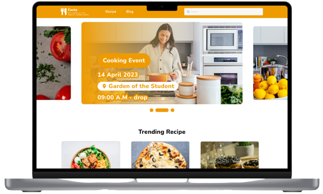
Most of user unfamiliar with homepage without promo or something attracted on desktop preview. So it add a banner picture related to activity of cooking.
Refining the Design 🍩
Early designs give only info about the ingredients. After usability study, it add buy button to show more info like price of the ingredient in partner app
Before Usability Study 1
After Usability Study 1
For the desktop version. Previously it have similar homepage structure like the app but since it not satisfied user about external consistency of desktop about the banner or promotional in the fold area, si it add the banner to meet the expectation
Before Usability Study 2
After Usability Study 2
In general, most of user feel it intuitive to get to know about recipe and get guidance to cook the healthy food.