Cahyadesthian R. Widigda | UX Design (concept to delivery) Feb – March 2023 * this project is created for Google UX Design Certification
Project Overview
The Product
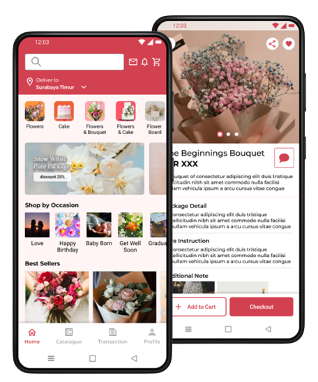
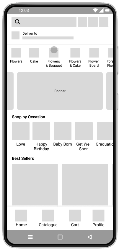
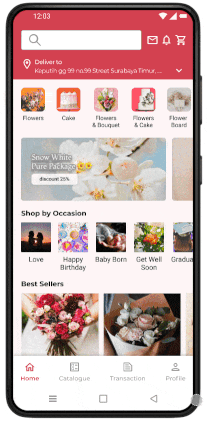
Puspita Florist App is an app for those people that need to buy 🛍 Puspita Store’s stuff including flower things and cake. This app accommodate people who want to order flower stuff in efficient and reliable way
Problem
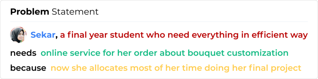
Busy people especially those who need a flower for special occasion but lack of time to go out.
The Goal
Provide online service of Puspita Florist to increase their revenue by reaching or providing online service so the customer can easily reach out for their flower or other stuff sold in Puspita Store.
My Responsibilites
Conducting research
Interviews for customer needs
Paper and Digital wireframing
low and high-fidelity prototyping
Conducting usability studies
Accounting for accessibility
Iteration on designs.
Understanding the User ♥
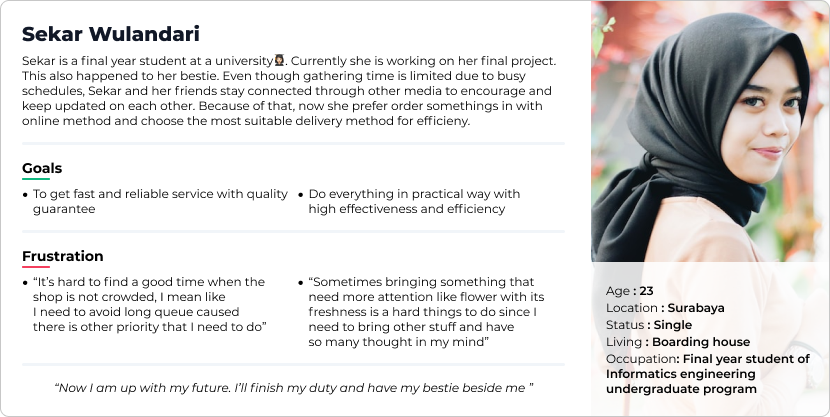
I conduct interview with some people that related with florist business. All of them come from buyer perspective. After interview, I create empathy map to point out important things from interview participant.
Pain Points
Online Availability
A platform where people can order and see catalogue of the product clearly
Delivery
Bring big stuff with special attention is not an easy things
Persona
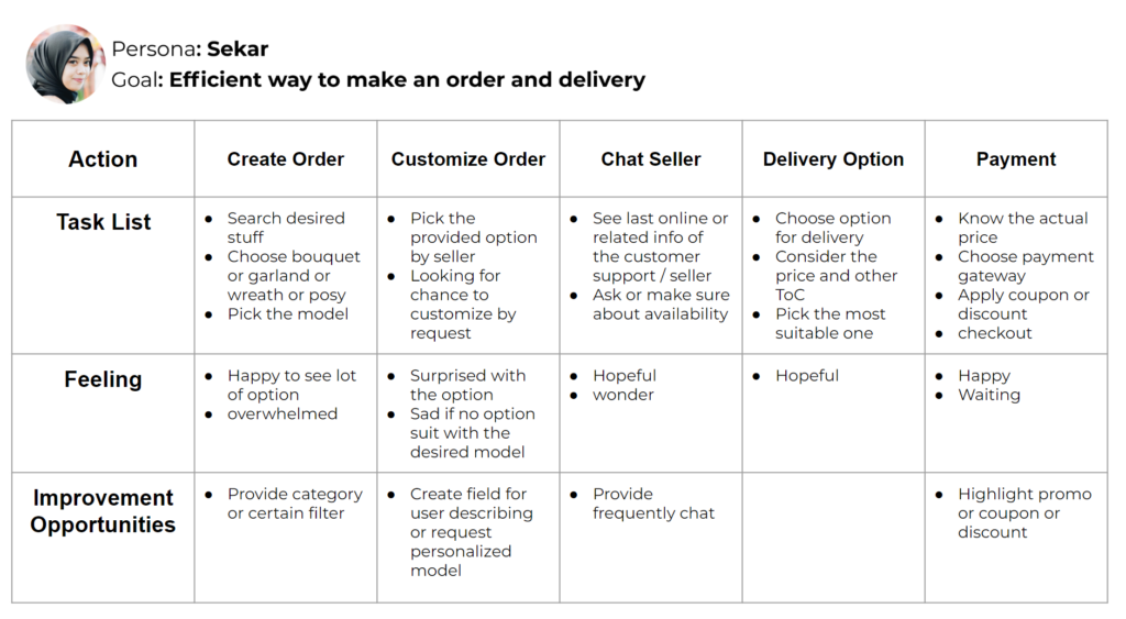
User Journey
Starting the Design
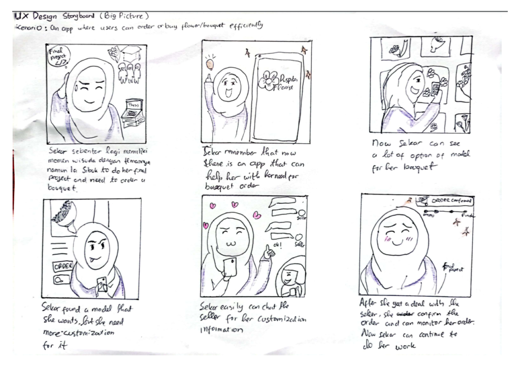
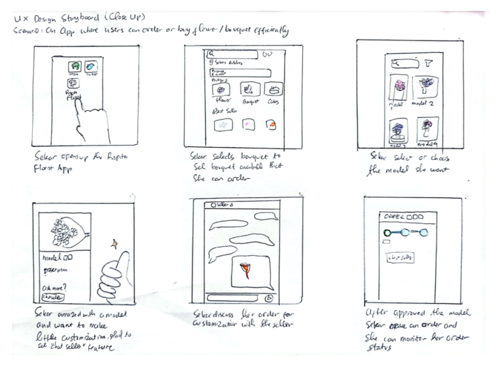
Story Board (Big Picture & Close-Up)
Big picture story board is created to get better vision about how the app will give impact to user. The Close-up model help to give vision about how user will interact with the app
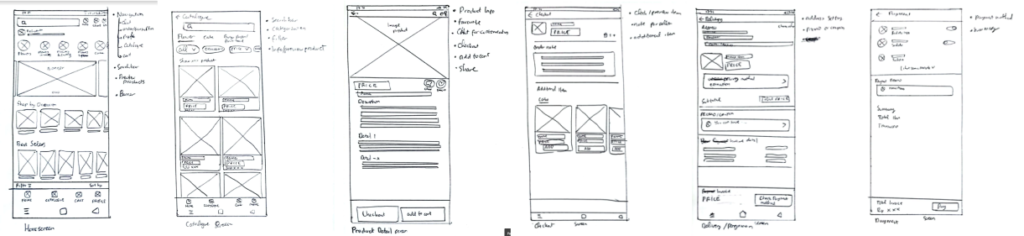
Paper Wireframe
Allocating some times to draft iterations of key screen of the app’s flow of ordering process things. Draw them on paper to create fast picture of the concept and think about the elements for answering user pain points.
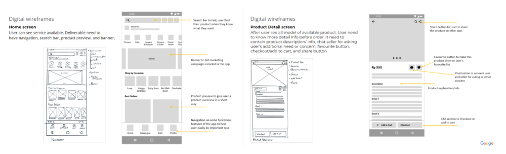
Digital Wireframe
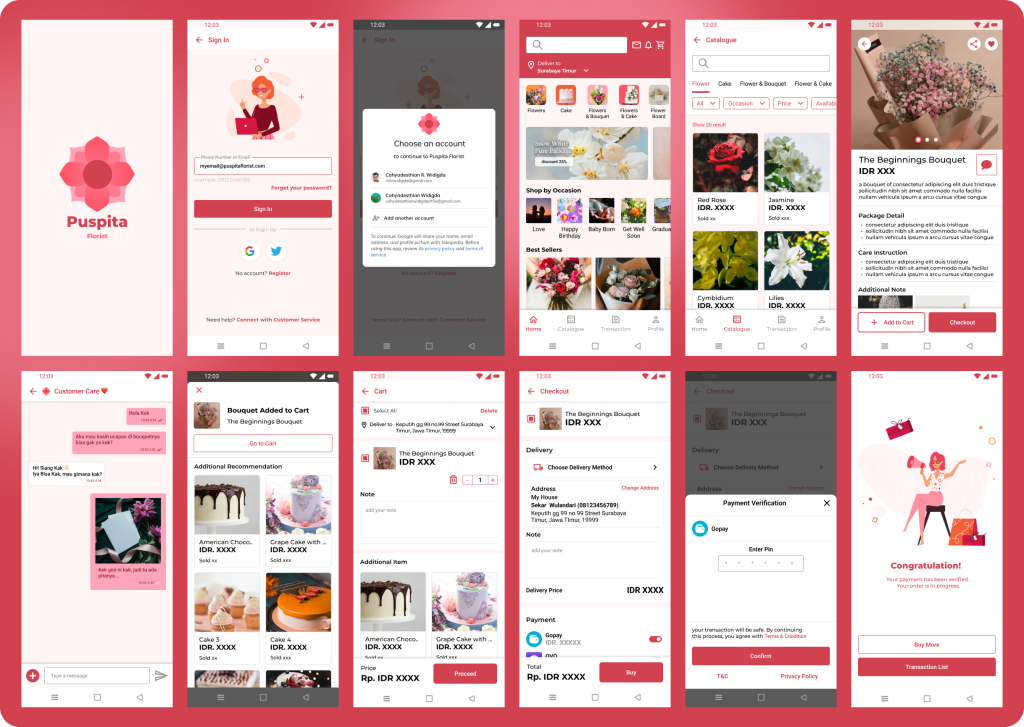
Low-fidelity prototype
By completed set of digital wireframes,low-fidelity prototype created. The primary user flow is about order a product this will also be prototyped to be used in a usability study.
Two rounds of usability studies conducted along the process. First study helped guide the designs from wireframes to mockups and adjust some broken flow. The second study used a high-fidelity prototype and revealed what aspects of the mockups need to be refined.
Round 1 findings
User wondering about the categorization available. So it add a brief of an app in a form of “On Boarding” page
Users get new insight of the information about keeping the product in good condition. Enhanced the product information for more informative stuff of the product
User need a flow of checkout that concise and accommodate all order need from existing design. Solution come up by stacking the payment and delivery with concise option in a screen to make shorter flow.
Round 2 findings
Most of user skip the on boarding page. Change it to a short brief video page that can be skipped
Navigation placement of Cart and Transaction not familiar. The placement of those navigation doesn’t need external consistency, so it rearranged to meet the consistency.
Refining the Design
Early designs give user fast direct from opening app to the main page (to make their process or buying product faster), but then the user feel wondering about some things of the app like the categorization reasoning. So the solution came up with the on boarding screen before redirecting to homepage for first time user
Before Usability Study 1
After Usability Study 1
From previously using on boarding screen, it found out that users skipped it and prefer short brief video. It also give a refinement on replacement of navigation to meet external consistency of e-commerce app